MONTANEZ DESIGN
Branding
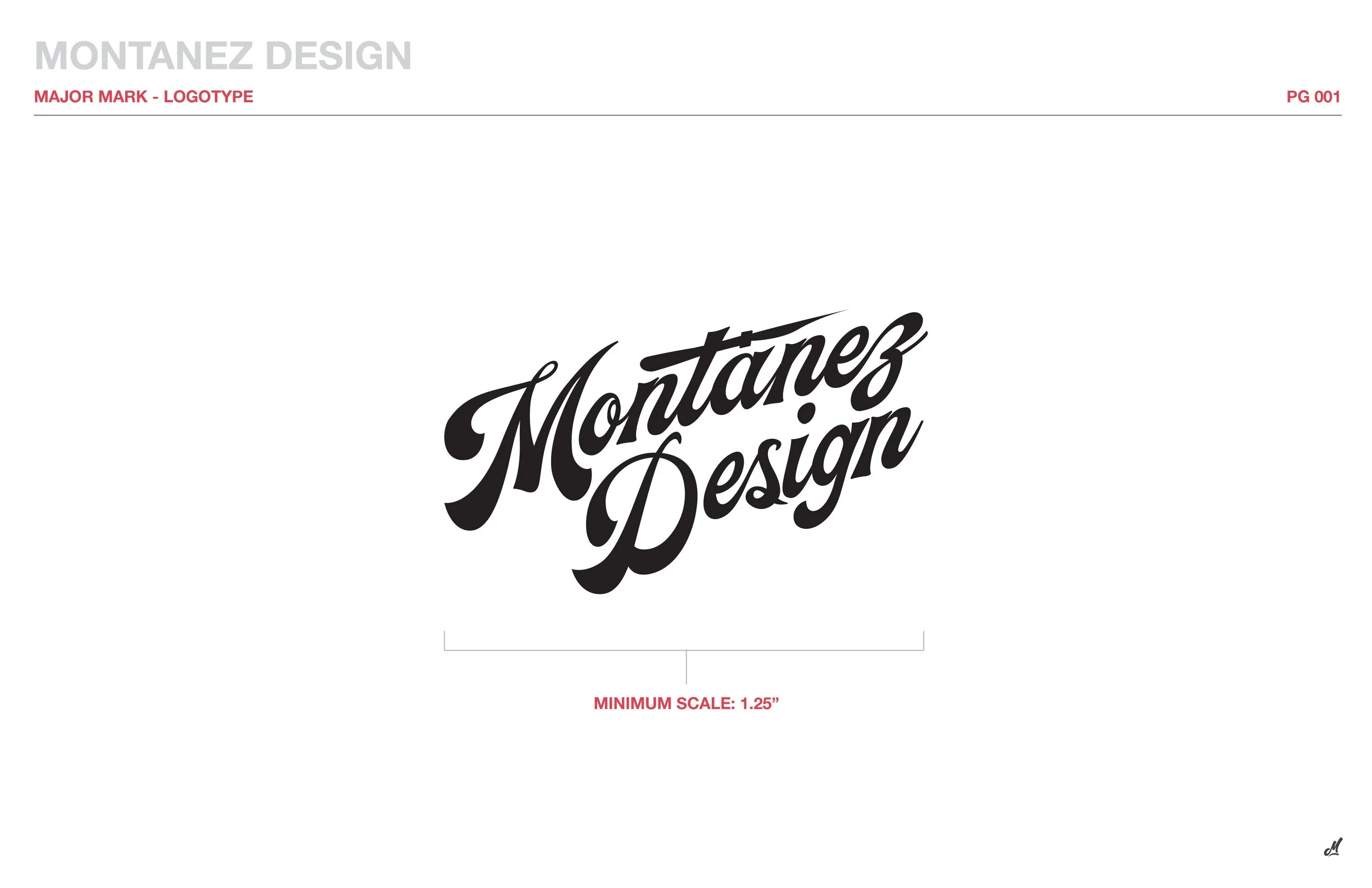
As a custom painter, Mike was having a hard time finding a modern approach to the classic “Sign Painter” logotype. We talked about design influences and historical styles, his customer base and his projects, and ultimately ended up coming to the conclusion that these were all vastly different from one another.
With this insight I set out trying to create a logotype that not only spoke to his craft but also him as a person. While his demographic is vast, it’s due to his personal style and skill that these individuals with diverse needs come to him.
INITIAL WORK


Step one was to eliminate all the directions we felt would speak too directly to the classic designs seen in sign painting logos and branding. After exploring a few avenues, we decided to return to a script but keeping in mind not to hit too directly on the “basic” script of yester-year.
NARROWING IN
After deciding a script would still be used to create a more visually dynamic mark, we narrowed in on a style that felt handcrafted and precise while still giving the edge and “life” that makes Mike’s work so special. I planned to build a scalable system that worked for all sizes and levels of information, and mated that with a color system that allowed for adaptability across the vast color landscapes in his final products.
FINAL MARK
Our final mark, with the main brand colors in use.


