JOYPOP
Branding
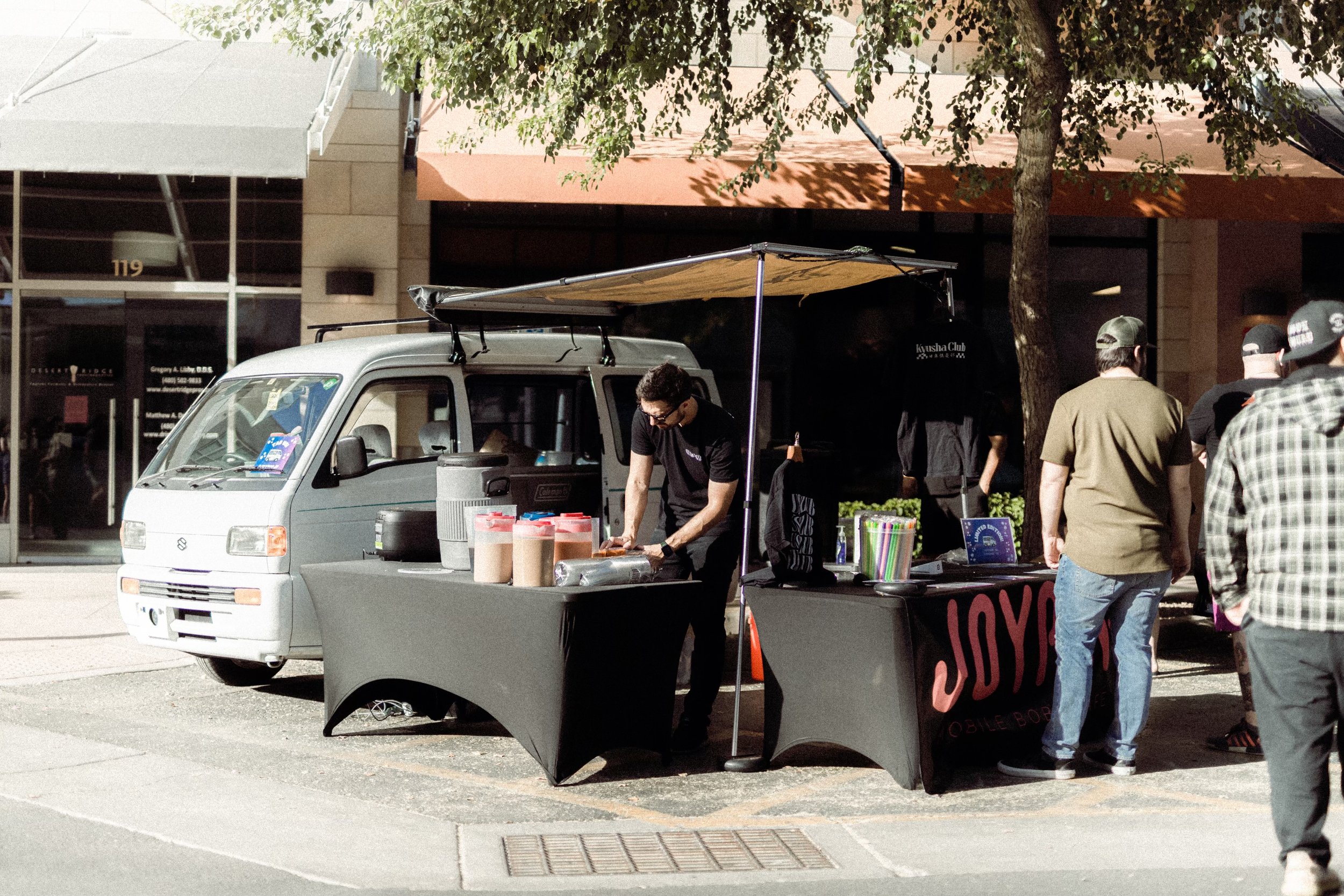
This Mobile Boba shop stands out on its own everywhere it goes. The name Joypop, comes from the japanese-imported van which the owner Oliver sells boba out of.
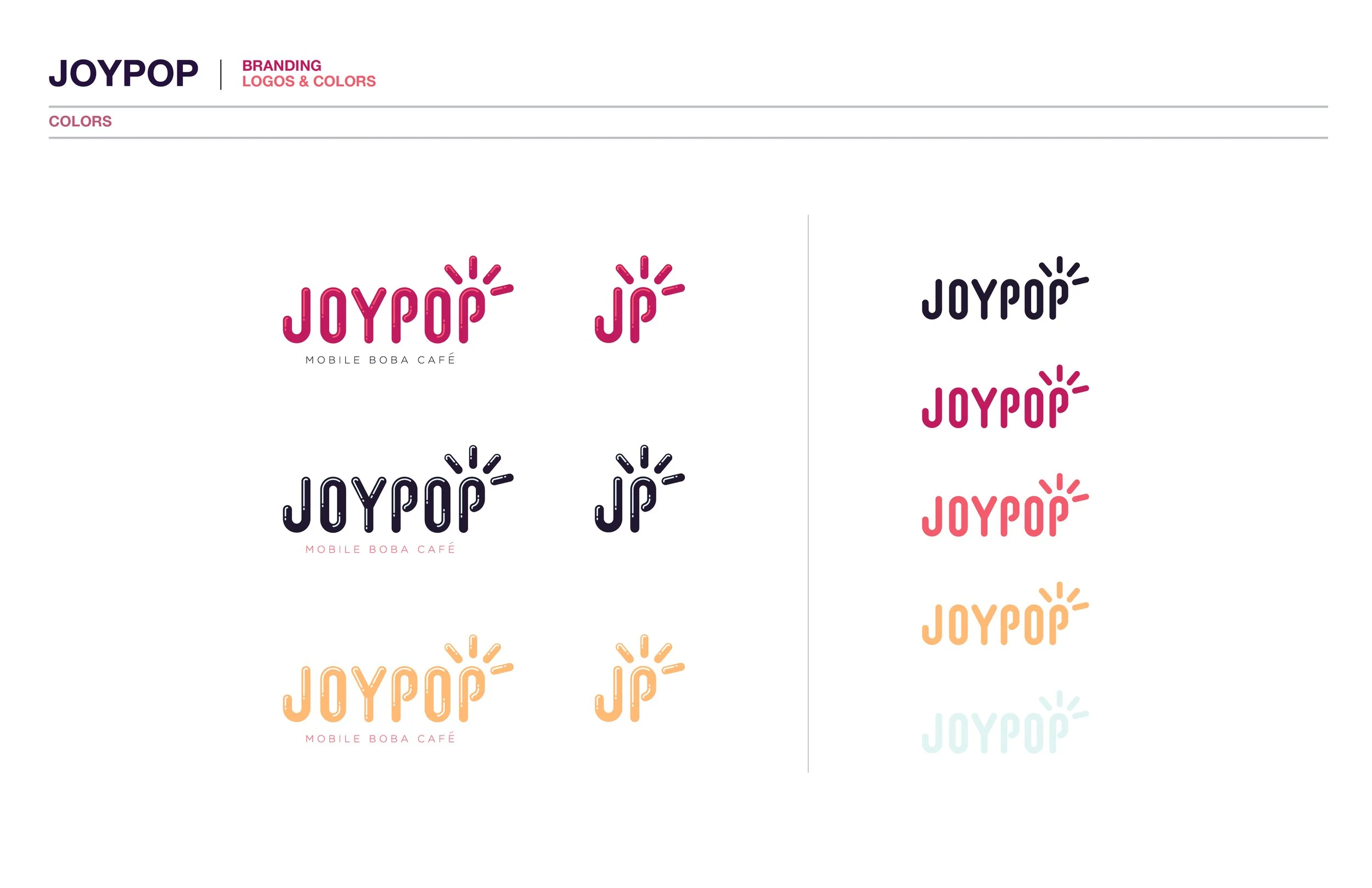
When a logo was needed for his first event, we got together and laid out a few directions we thought fit the demographic and theme he had in his head. I spent a few iterations getting to the final mark but ultimately landed with an solid color set, a character, and the logotype variations seen here.
INITIAL WORK


With some idea of where the brand was supposed to land based on strong demographic knowledge, I felt confident turning right to solutions in the early phases. I put together some ideas as well as existing typefaces I thought were close enough to sell the vibe Oliver was going for and Joypop needed.
NARROWING IN
With confirmation on which styles were working, we narrowed down the options and I began translating them to the more minor marks. A few colorways were then decided based on the demographic knowledge and existing brand landscape. We wanted the brand to be fun and cute, while maintaining a certain maturity that one has come to expect from a modern food-truck engagement.
BUILDING THE CHARACTER
The brand was visually fun and cute as we had originally discussed but we wanted to give it a bit more life and entice a younger crowds. The character was born from a simple sketch and can be used in a few different ways to create lock-ups and is adaptable in color to drink menu items.


